People Notice a Subtle Feature in the Coca-Cola Logo

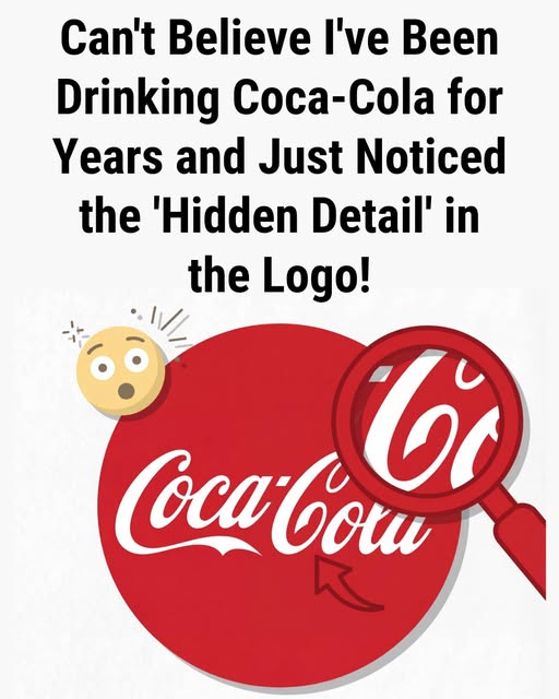
It happens in an instant. Someone points it out, and the logo changes forever. That second “C” in Cola stops being a curve of ink and becomes something else: a smile. Once noticed, it can’t be unseen. The letter feels warmer, more human, as if the bottle itself were quietly welcoming you. Was this a deliberate design choice, or simply the mind’s instinct to search for friendliness in familiar shapes?
The Coca-Cola script dates back to the 1880s, created by bookkeeper Frank Mason Robinson, who gave the brand its flowing Spencerian style. There is no record of hidden meaning, no notes suggesting emotion was intended. Everything points to ornament and elegance, not expression. Yet over time, that graceful curve began to feel like something more. Decoration slowly turned into perceived warmth.
This shift says less about typography and more about psychology. The logo never changed—we did. The human brain is wired to find faces in clouds and emotion in simple forms. After generations of advertising tied to comfort, celebration, and shared moments, the mind connects those feelings back to the shape itself. The smile exists because memory keeps reinforcing it.
Every enduring symbol lives two lives: one on paper, one in imagination. The archive shows ink and curves; experience adds meaning. In the end, the smile is not proof of clever branding alone, but of something deeper—our tendency to search for reassurance, even in letters, that the world is glad we’re here.


